PyReconstruct
Introduced an onboarding system that replaced one-on-one training for every new researcher
00 — Context
What is PyReconstruct?
PyReconstruct is a neuroscience tool used by researchers at UT Austin to trace, annotate, and reconstruct 3D models of brain synapses from electron microscopy images. It's a critical daily-use research tool — yet had a SUS score of 67.5, firmly in the "Grade D" range.
Our team of five designers partnered with the PyReconstruct development team to identify usability barriers and design targeted improvements — working directly with the developers and a professor who oversaw real lab usage.
Problem Statement
New users struggle to independently navigate PyReconstruct because critical workflows and system states are not visible or persistent, leading to heavy reliance on manual training.
What this meant for researchers
Slower Research Progress
Time was spent learning the tool instead of analyzing data, delaying reconstruction workflows and outputs.
Dependence on Expert Users
New users required constant guidance from experienced researchers, creating bottlenecks and uneven knowledge transfer.
Reduced Confidence & Errors
Unclear system states and hidden workflows led to mistakes and uncertainty, especially during early use.
Process
How we got there
01 — Research
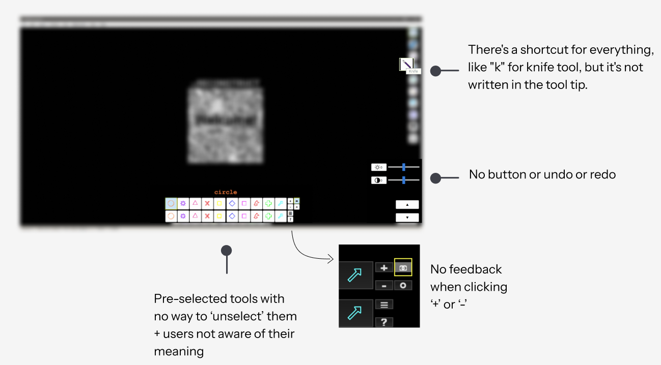
Heuristic Analysis
While 30+ heuristic violations were identified, not all had equal impact on user experience. We prioritized issues based on:
Did this block or slow down key reconstruction tasks?
Did this increase reliance on training or hinder independent use?
How often would users encounter this issue?
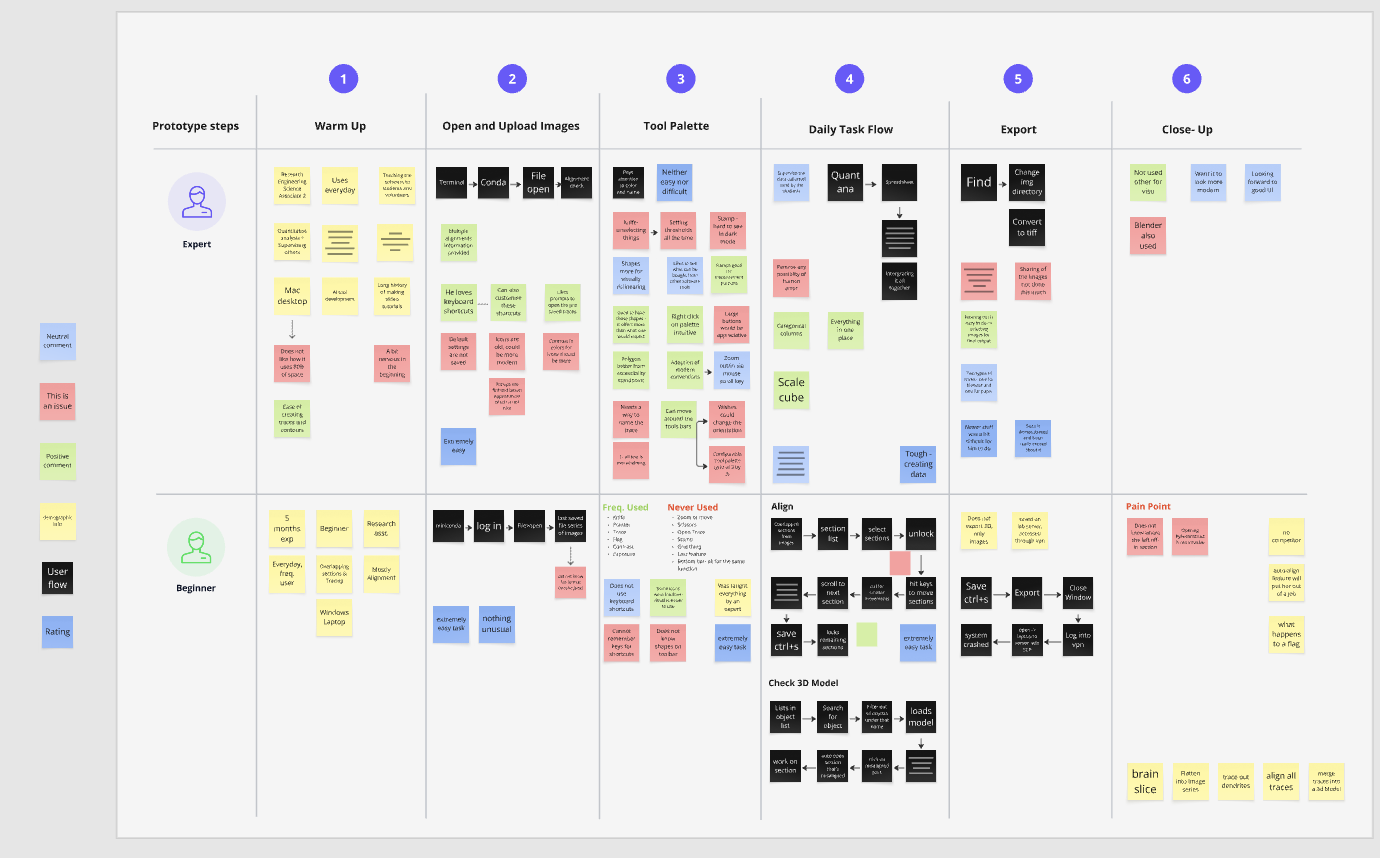
User Interviews
Two very different users, one shared frustration
Key Objectives
Primary Motivations
Participant Context
Participants ranged from first-week users to researchers with 2+ years of daily use
Daily to weekly — PyReconstruct was a core part of their reconstruction workflow
All new users reported needing direct guidance from a colleague to get started
Key Observation
Most users relied on external guidance during early use and struggled to build a mental model of the system independently.
Themes
Reliance on External Guidance
- Users depended on experienced researchers to navigate the tool
- Learning was social, not system-driven
Low Workflow Visibility
- Key steps were not discoverable without prior training
- Users couldn't anticipate next actions in a workflow
High Cognitive Load
- Users relied on memory over interface cues
- Errors increased significantly during early use
02 — Early Explorations & Designs
Guided Entry Point
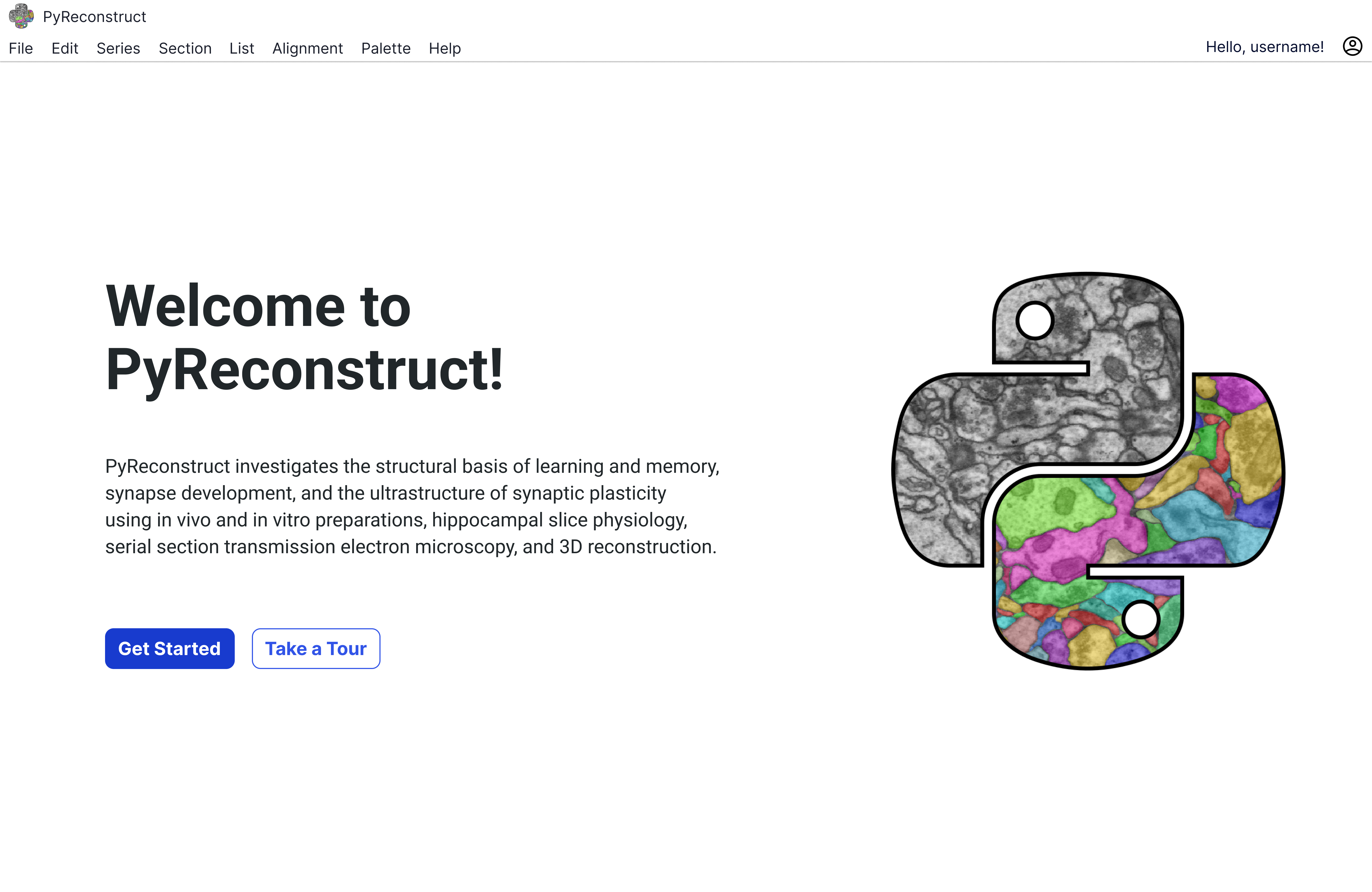
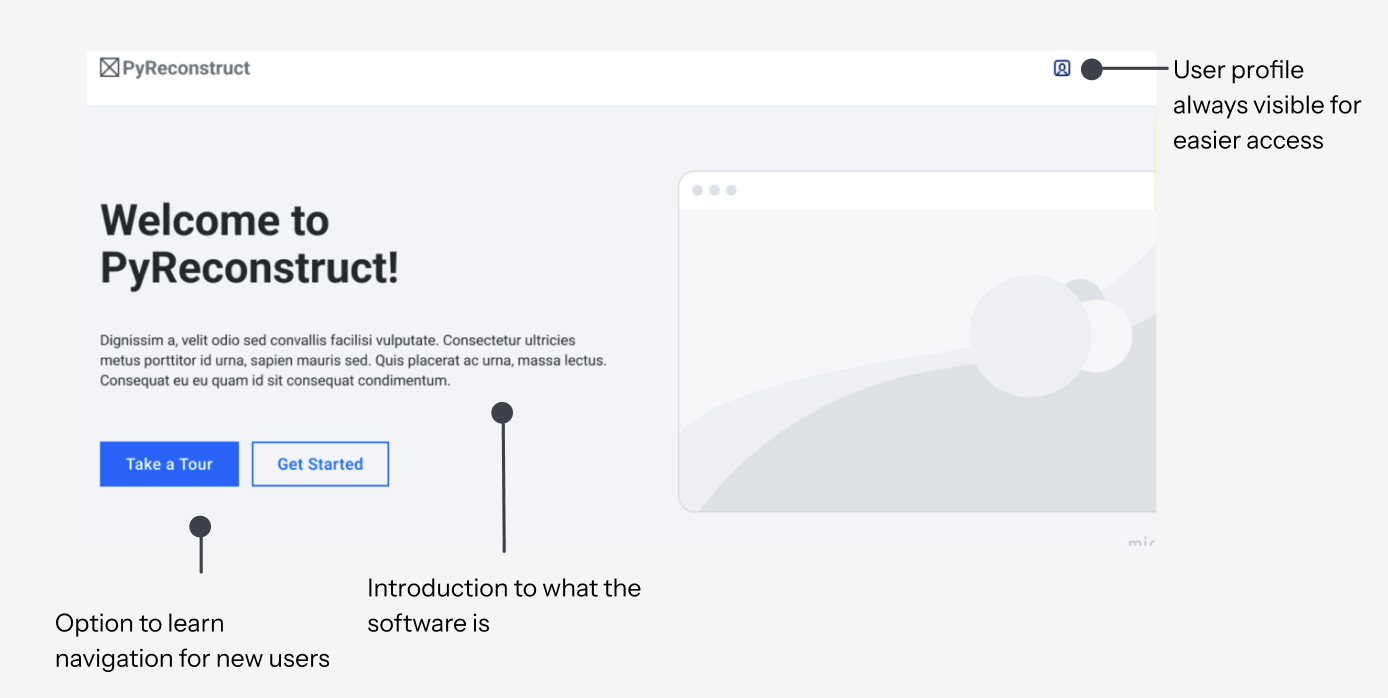
We introduced a welcome screen to guide both new and returning users before they enter the tool.
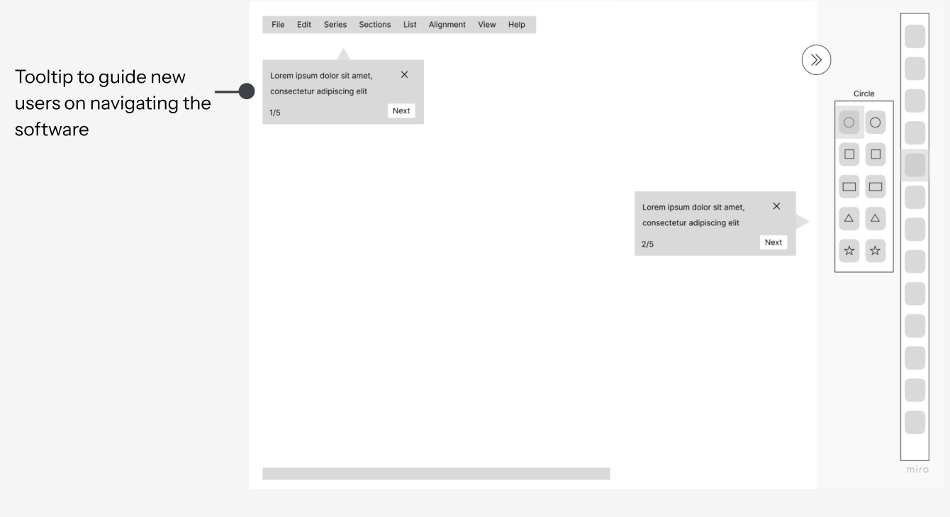
Contextual Tooltips
A guided entry point was designed to orient users before entering the system, helping both new and returning users understand available workflows.
Tooltip Iterations
- Skip vs Next — so users always feel in control, never trapped in the flow
- Step counter top right — so users know where they are without it interrupting the content
- × close button — so users can exit on their own terms at any moment
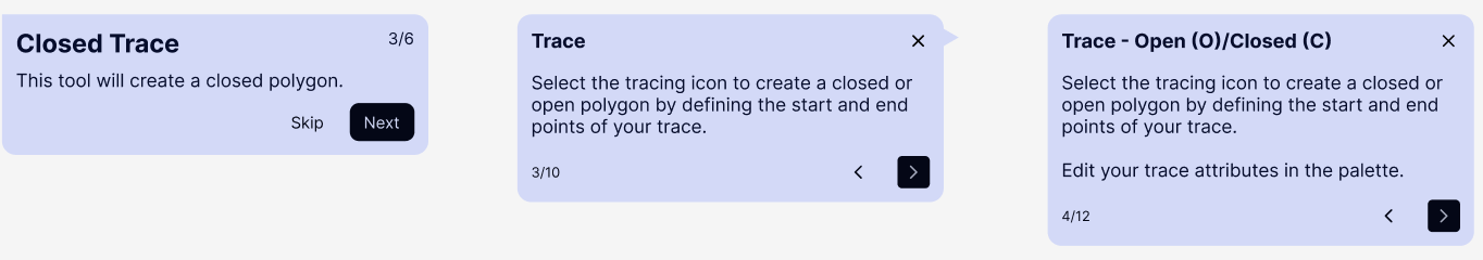
- Chevrons instead of text buttons — so navigation feels lighter and doesn't compete with the actual message
- Step counter moves to the bottom — so the header stays clean and the first thing you read is the content, not the progress
- Keyboard shortcuts in the title — so power users can act immediately without reading the whole tooltip
- Second paragraph added — so users don't just know what the tool is, but know what to do next
- Wider layout — so the extra content has room to breathe and doesn't feel cramped or overwhelming
04 — Solution
Before vs. after: a user's first day
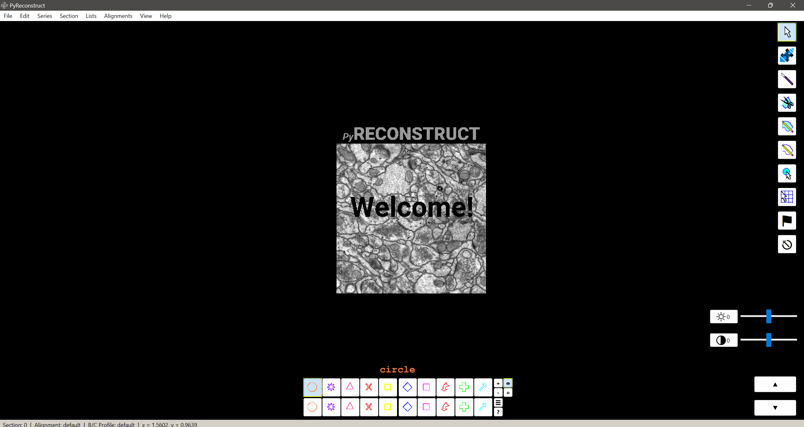
Before
- Open app → black screen, no guidance
- Find a colleague to show you around
- Ask how to import an image series
- Ask what the knife tool does
- Ask how to access 3D view
- Still unsure about shortcuts weeks later
After
- Welcome screen — Get Started or Take a Tour
- Tour step 1 — Import and define assets (⌘N)
- Knife tool explained inline, step 3
- Covers trace, stamp, 3D access, shortcuts
- Links to Help resources & searchable shortcuts
- Ends with confetti — tour complete
Final Prototype
05 — Outcomes
Measurable improvements, handed off
We delivered Figma assets, a WCAG accessibility guide, and 20+ design recommendations directly to the PyReconstruct development team.
