Case Study · Usability Research
When "Different" Becomes Difficult
Evaluating how non-standard UX patterns shape first-time user confidence and decision-making on GOAT
The Problem
GOAT's interface stands out —
but not always in a good way.
- Users freeze on simple tasks because the UI breaks their mental model
- High-stakes moments like bidding feel risky — and entirely unconfirmed
Research Question
How do first-time users interpret a non-standard e-commerce experience — and where does it break?
Approach
Heuristic Evaluation
Eight issues. Four were serious.
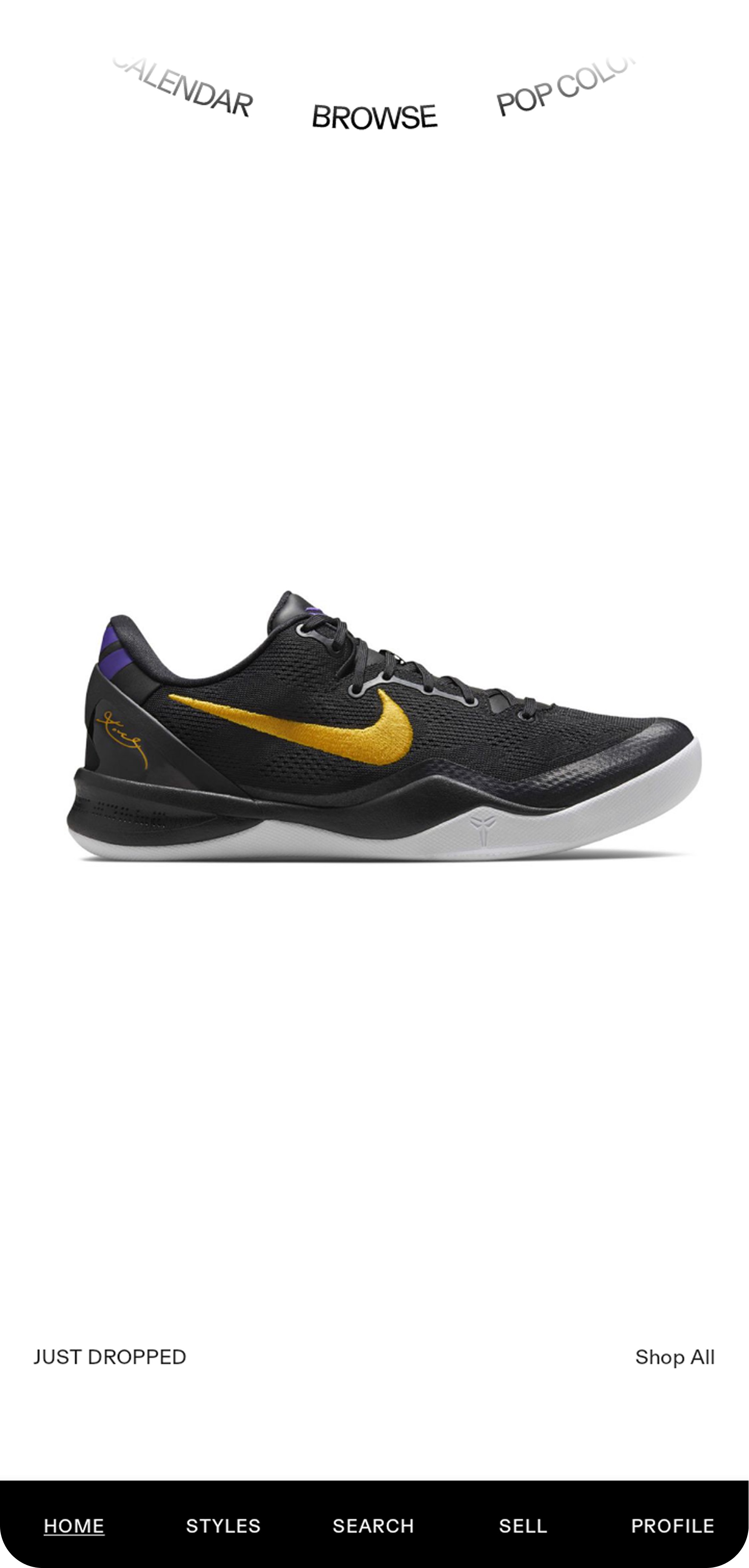
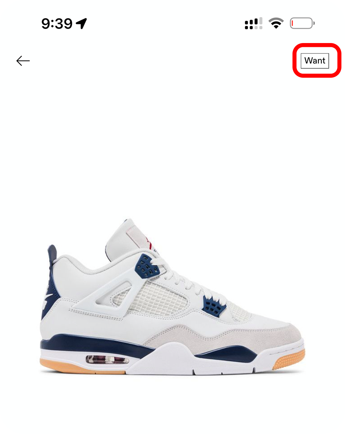
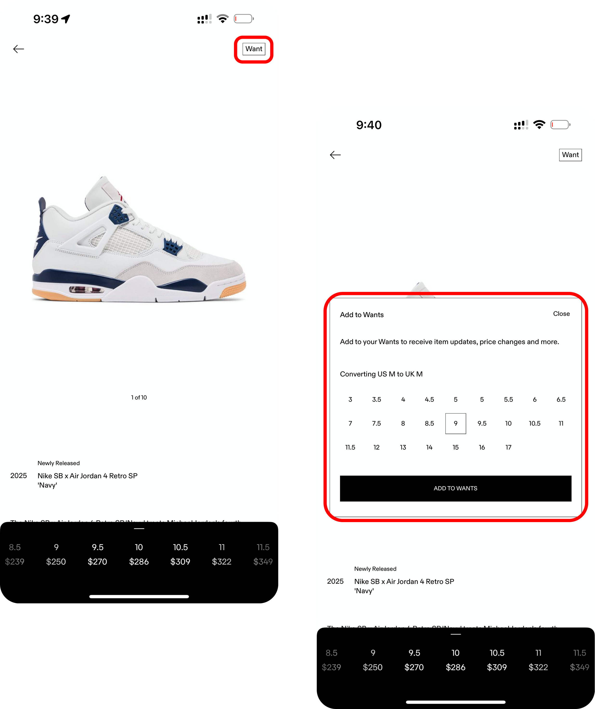
"Want" means Save — but nobody knows that
Every participant looked for a heart or bookmark icon. The 4-step save flow directly caused the study's lowest task success rate.
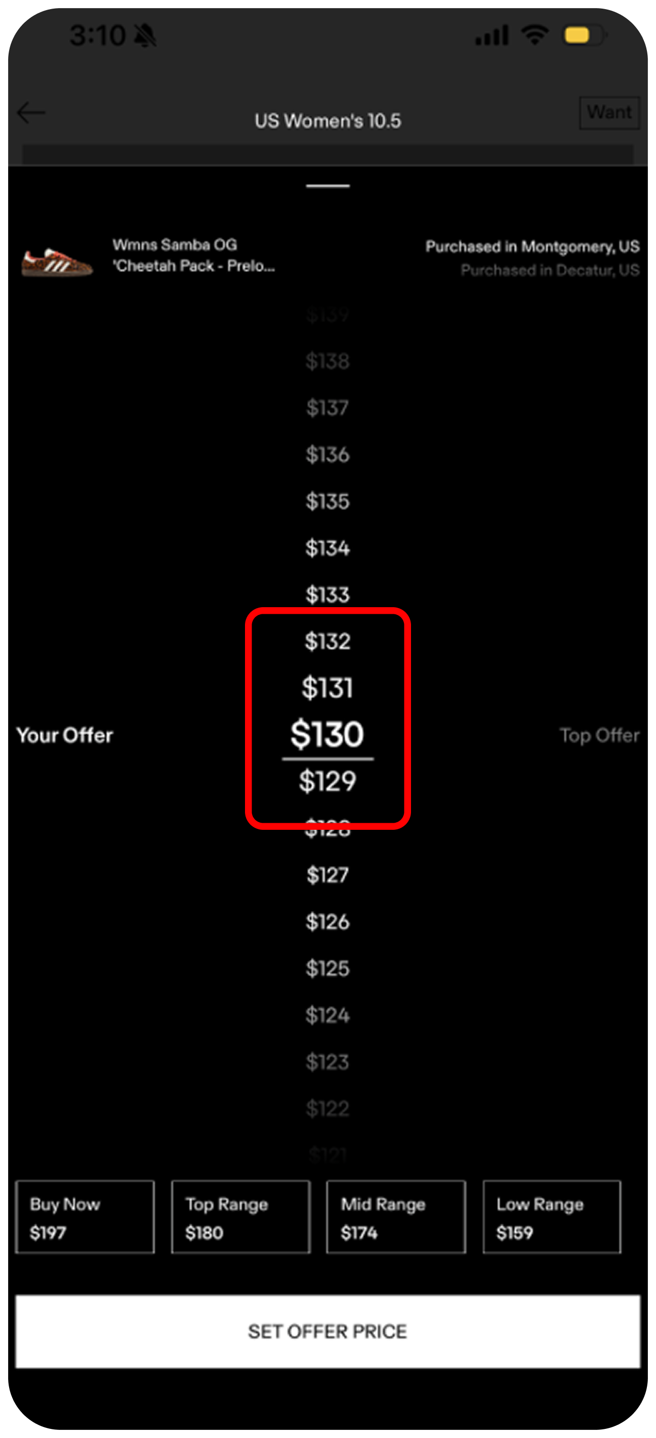
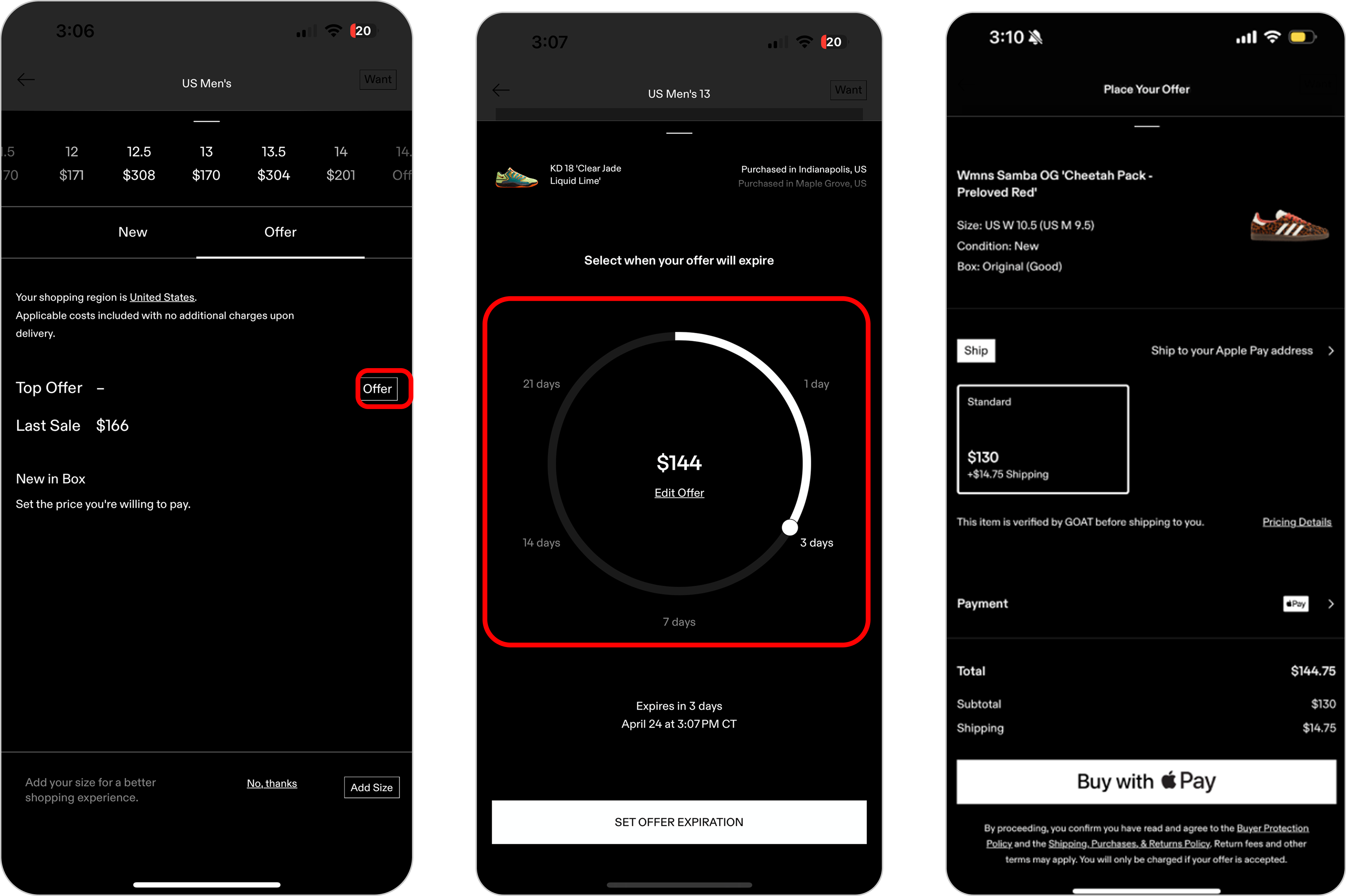
No confirmation before a bid is submitted
Tapping "Set Offer Price" submits immediately — no summary, no confirmation, no total cost. On a platform where a bid is a legally binding $500+ commitment, frictionless isn't a feature.
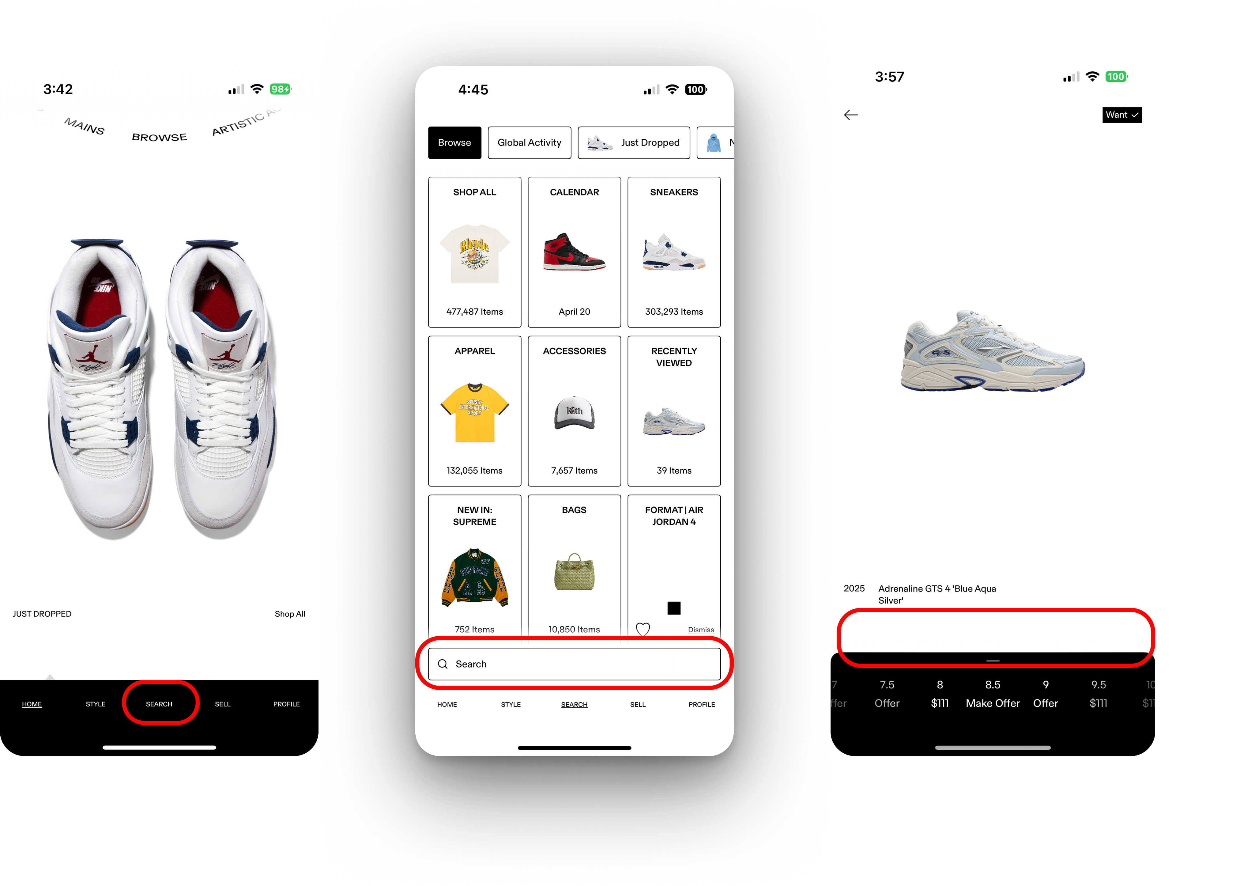
Heart icon saves a search — not a product
On search results, a heart sits top-right. Every user expected it to favorite an item. Instead, it saves the entire search query — causing direct task failures.
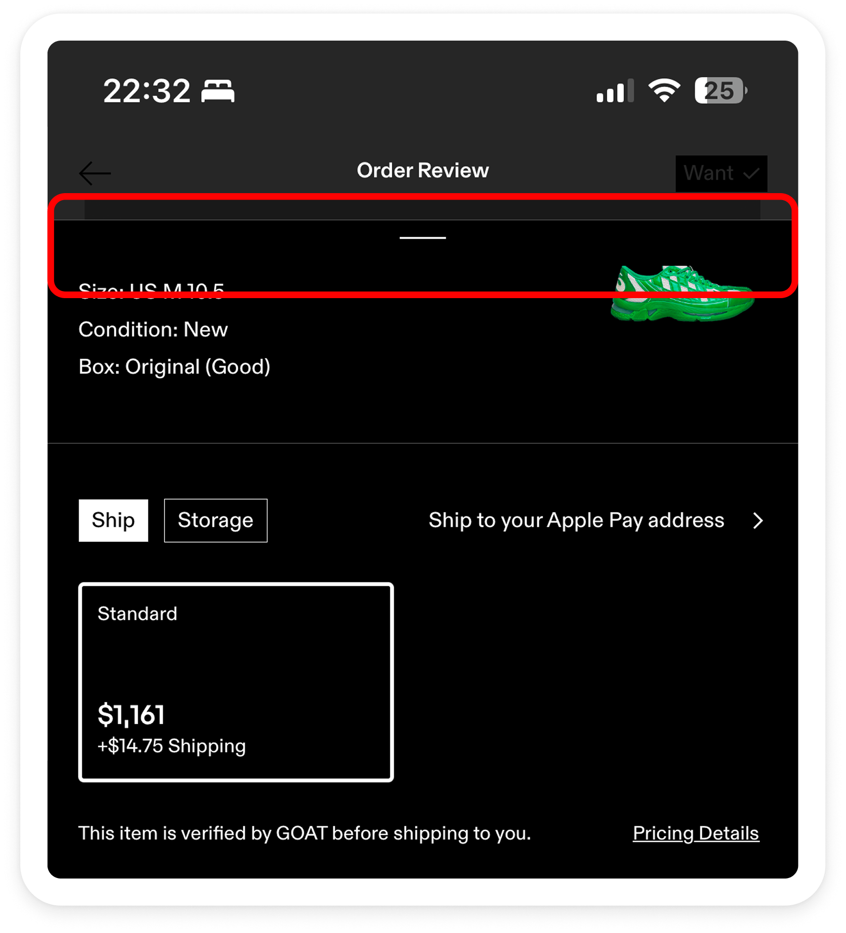
No back button on the Order Review page
The Order Review screen has no visible back or cancel button. The only exit is a swipe-down gesture most users don't know exists.
Tasks
Five tasks. One broken moment.
Key Metrics
The numbers tell a confidence story.
Kind of scary with how easy it is to go through without any confirmation.
— Participant 4, Bid task
Affinity Diagram — Participant quotes organised into themes
Core Insights
Task success is not the same as user confidence.
When patterns break, users hesitate
Users don't explore — they pattern match.
Fast ≠ trustworthy
High-stakes actions need friction.
Users weren't confused — they were unsure
Confidence matters more than simplicity.
Competitive Analysis
The market has already solved this.
| Feature | GOAT | StockX | eBay | Grailed |
|---|---|---|---|---|
| Bid confirmation screen | ✗ | ✓ | ✓ | ✓ |
| Standard wishlist / save icon | ✗ | ✓ | ✓ | ✓ |
| Apply multiple filters at once | ✗ | ✓ | ✓ | ✓ |
| Persistent wishlist in nav | ✗ | ✓ | ✓ | ✓ |
| Clear search from results page | ✗ | ✓ | ✓ | ✓ |
| AR try-on | ✓ | ✗ | ✗ | ✗ |
| Authentication pipeline | Multi-step | Multi-step | Guarantee | None |
The goal isn't to make GOAT look like StockX. It's to fix the four rows where GOAT is the only platform without a solution.
Recommendations
Three fixes. Real product impact.
Align with user expectations
- Replace "Want" with a heart or bookmark icon
- Use standard labeling — "Save", "Buy Now", "Place Bid"
- Match search bar placement to convention
Add confidence at key moments
- Confirmation modal before any bid or purchase
- Visual feedback when filters are applied
- Success state after saving an item
Reduce unnecessary steps
- Save first, customize later — fewer taps to wishlist
- Remove redundant Offer double-tap
- Progressive onboarding for first-time bidders
Projected Impact
If implemented, these changes would likely:
Conversion confidence
Users complete purchases without second-guessing themselves
Accidental actions
Confirmation states prevent costly, irreversible mistakes
First-time user retention
Onboarding friction reduced for the expanding mainstream market
SUS score
Target: 75+ — from 61.9 — through language, feedback, and confirmation
How I Think
I asked a product question, not just a usability one.
My approach
I designed the study around decision moments, not just task completion. A 100% success rate can still represent a broken experience.
What I prioritized
Expectation mismatches over complexity. GOAT isn't a hard app — it's an unfamiliar one. That distinction changes what you fix.
What I'd do next
Compare new vs. returning users. A/B test standard vs. non-standard patterns. Run a second usability round after implementing the top two fixes.
