EVA · Case study · 2026
An AI-assisted risk dashboard for early ovarian cancer detection.
4-month capstone. I designed and researched an AI risk-scoring dashboard clinicians could actually trust.
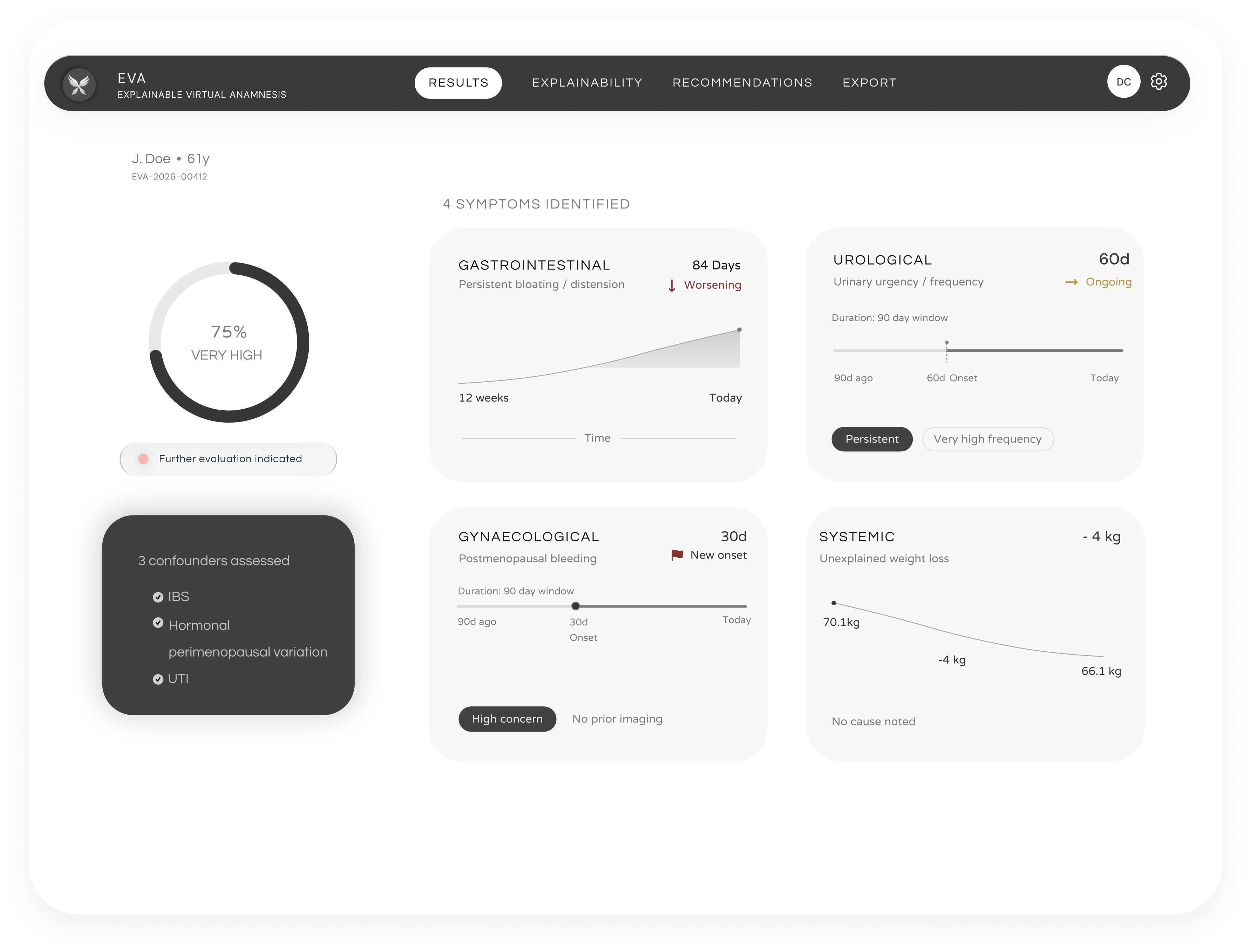
01 — Problem
70% of ovarian cancers are diagnosed at Stage III–IV.
Symptoms are vague alone. Nothing forces them into one pattern.
70%
diagnosed at Stage III–IV
5 of 8
daily clinician hours in the EHR
44%
of that time scanning for a pattern
02 — Research
What earns trust in an AI-generated score.
Two numbers from secondary research set hard constraints on the design.
87% → 33%
override rate, without vs. with visible reasoning
Decision — every score ships with its reasoning attached.
44%
of EHR time spent scanning notes for a pattern
Decision — replaced tables and text with graphical summaries.
03 — What clinicians pushed back on
Interviews and usability testing surfaced three tensions.
Each shaped a specific decision in the final design.
MD
Primary interviewClinician A
"If we don't encourage self-googled or ChatGPT diagnosis — how can our patients expect the same?"
Finding: wants AI to inform judgment, not replace it.
UT
Usability testingTesting cohort
"Minimal, but want all the important information at the same time."
Finding: brevity and completeness, both required at once.
V1
V1 feedbackClinician reviewer
"Too much purple."
Finding: visual tone read as unserious for clinical use.
04 — Before / after
Same content, restructured from tables into charts.
Information density didn't change. How it's read did.
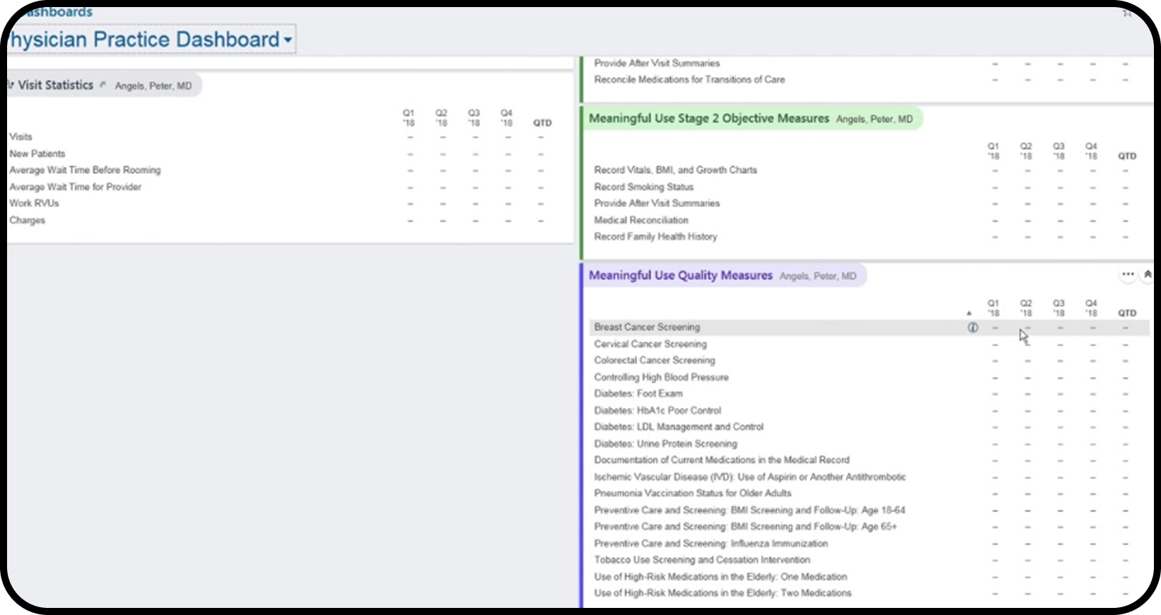
Before 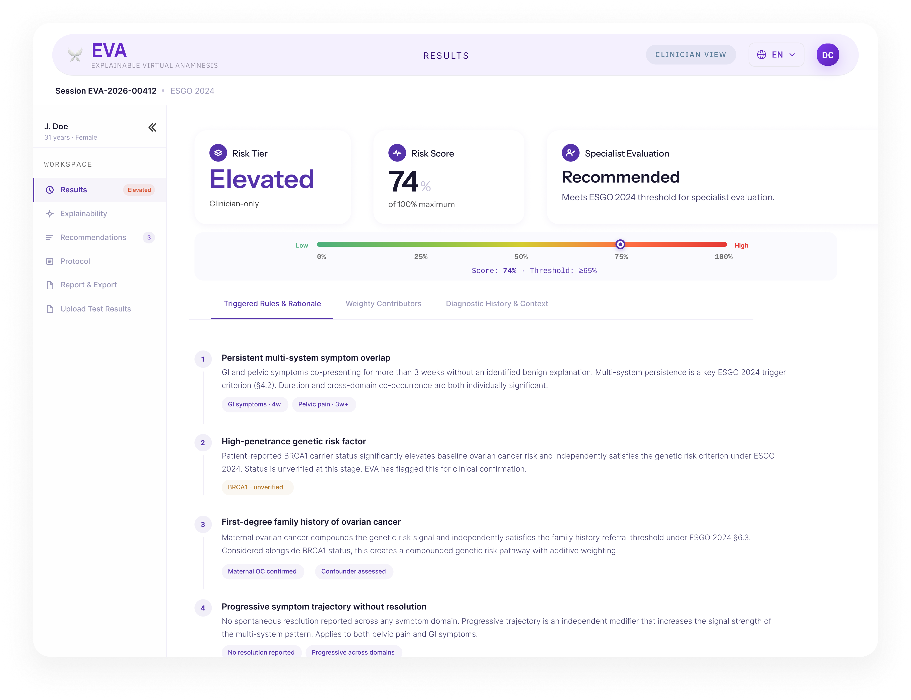
Results read as a compliance checklist.
After
Results read as a clinical picture.
Before 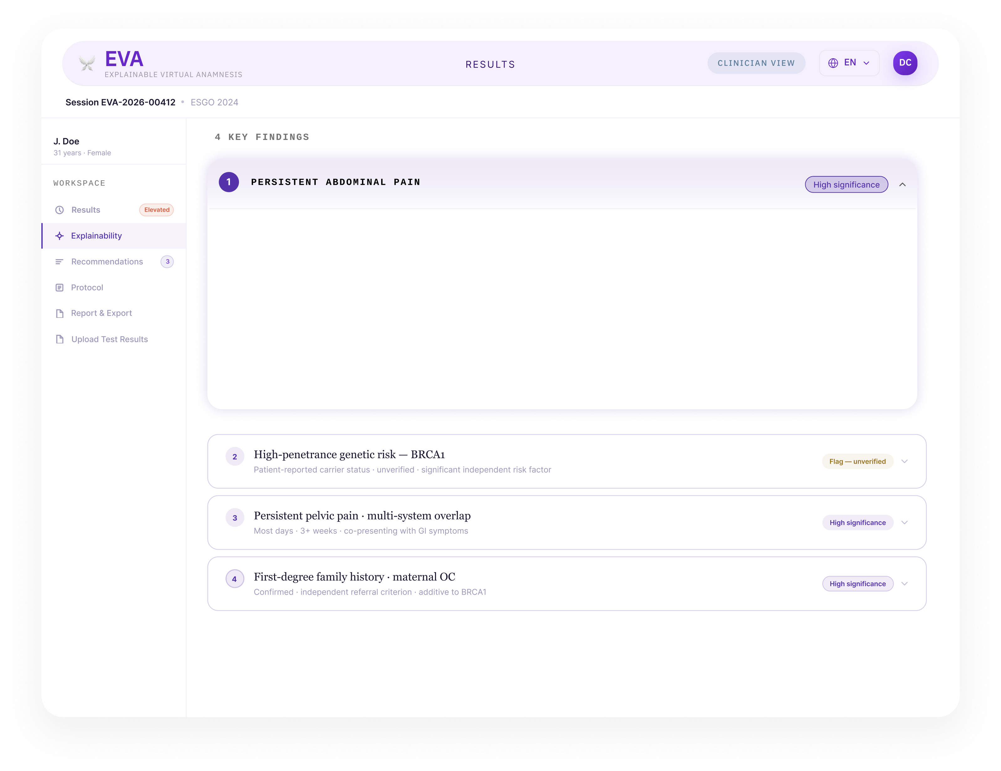
Findings listed one below another.
After 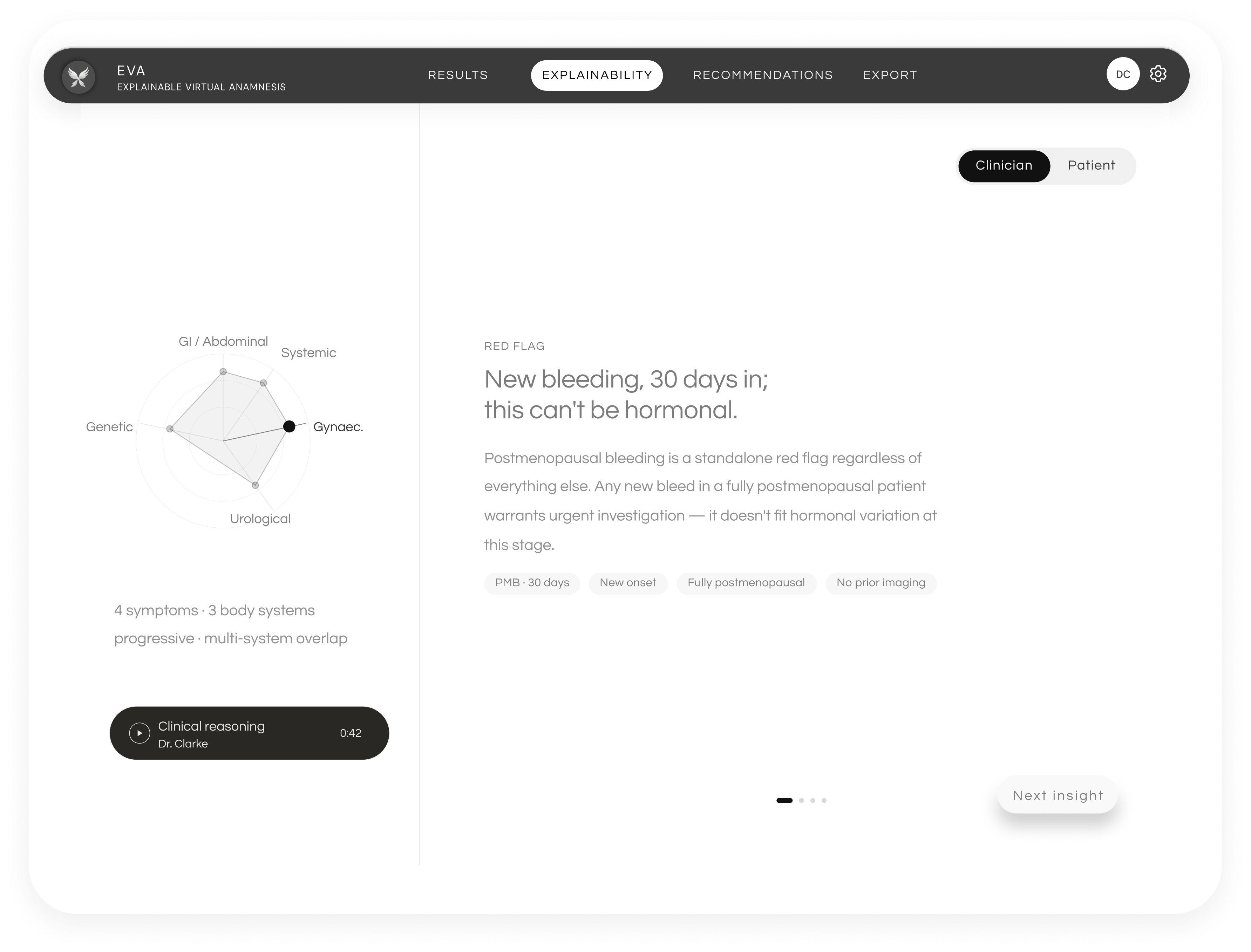
Same findings, as a chart and one red flag.
05 — Supporting process
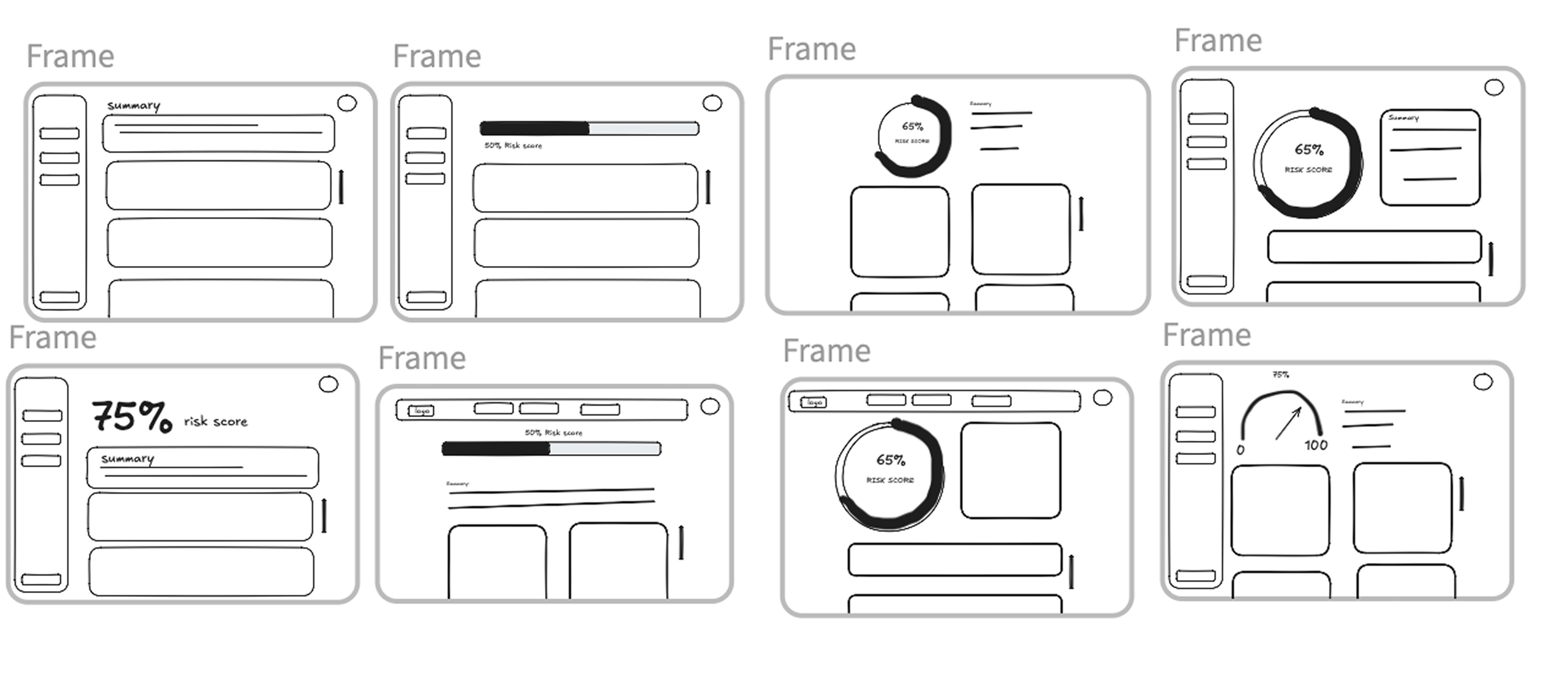
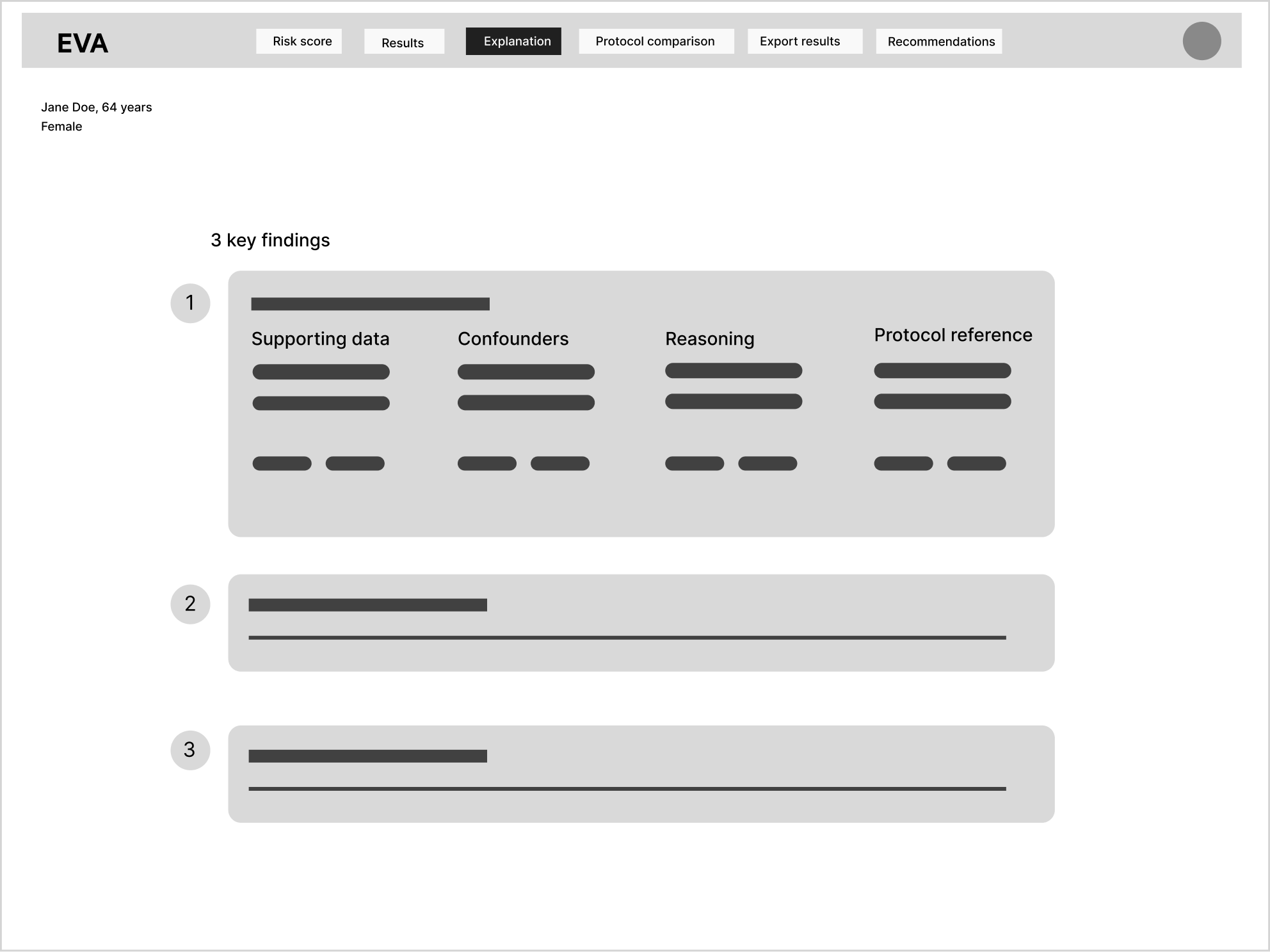
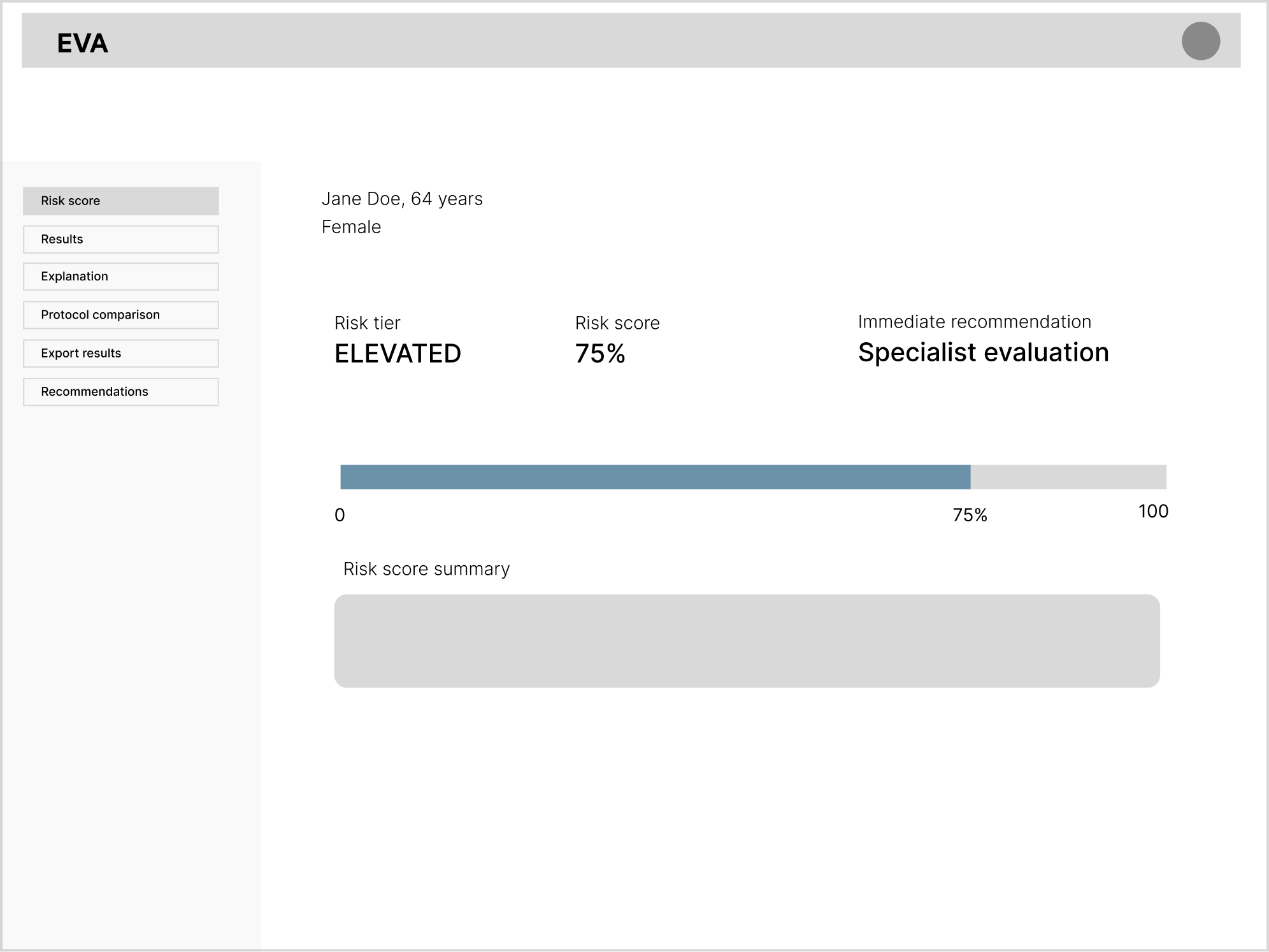
Structure and navigation, tested before visual design.

06 — Final design
Four screens, each tied to a decision above.
Applies: evidence attached to every score
01 — Results
Symptoms grouped by body system; confounders surfaced up front.
Applies: reasoning visible, not just a score
02 — Explainability
A radar chart makes cross-system overlap hard to dismiss.
Applies: nothing recommended without a reason 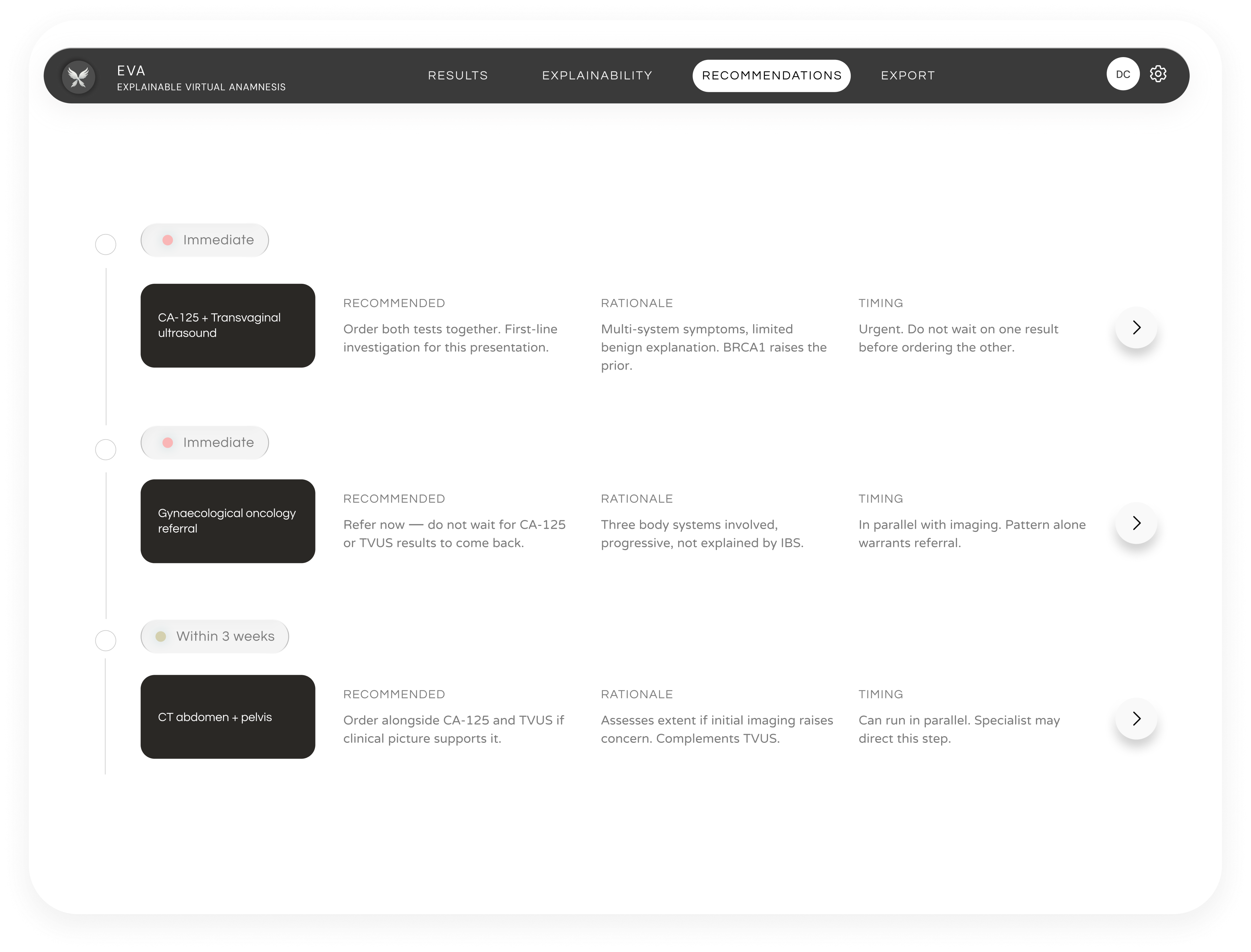
03 — Recommendations
Urgency tiering, with rationale and timing for every action.
Applies: one clean, clinician-grade handoff 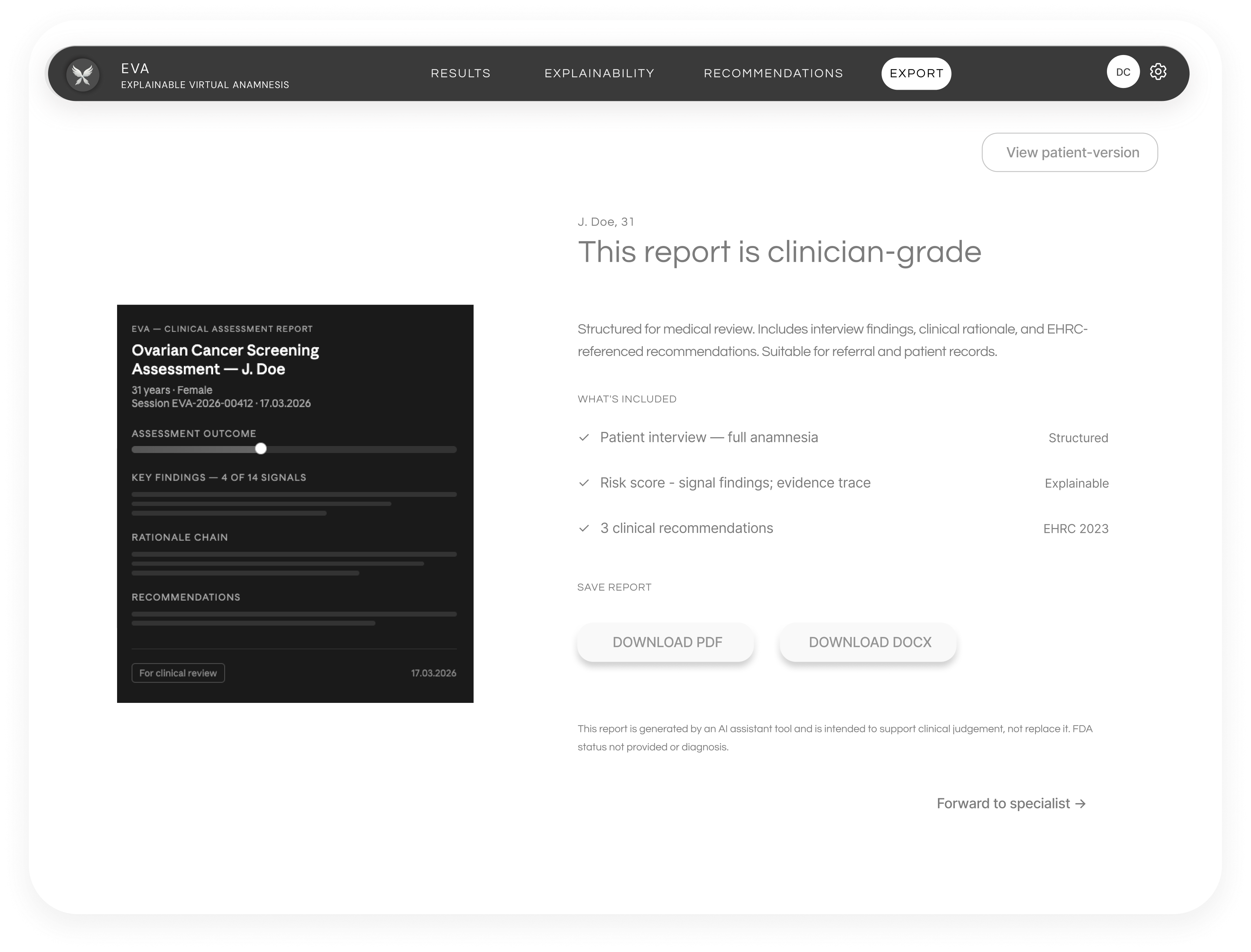
04 — Export
A structured report ready for a specialist or the patient record.
07 — Reflection
