NeuroScape
Designing NeuroScape from the ground up
00 — Overview
A pattern of demotivation I couldn't ignore
During my summer psychology internship, I observed a recurring pattern: patients attended therapy once or twice a week, working through the same exercises, while their families waited 3–4 hours at the clinic. The result was predictable — frustration, stagnant progress, and disengagement.
This cycle reinforced itself. Less frequent sessions meant less variety. Less variety meant less motivation. Less motivation meant slower recovery. I designed NeuroScape to break it.
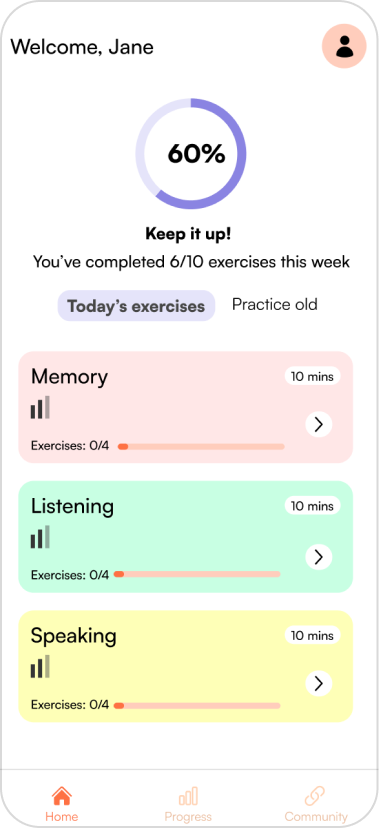
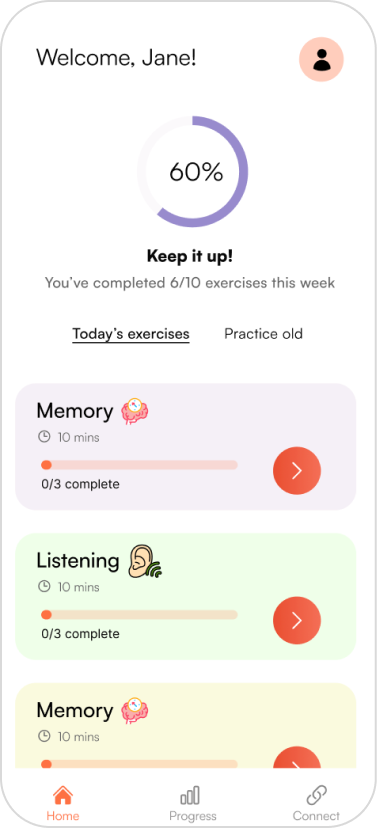
What NeuroScape provides
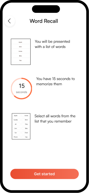
- Personalized exercises tailored to each patient's condition — so no two sessions feel the same.
- Progress tracking with visual dashboards — so patients and caregivers can see growth over time.
- At-home access — therapy continues between clinic visits, not just during them.
- Caregiver support tools — family members stay informed and involved in the recovery journey.
01 — Research
Three-phase research to understand the real problem
I started with secondary research to understand the field, moved into a month-long field study, and then conducted semi-structured interviews — collaborating with 3 professors to refine the interview schedule and ensure unbiased, non-leading questions.
Secondary research — what the literature confirmed
A literature review on rehabilitation issues confirmed the problem was systemic, not individual. Three statistics stood out:
of studies in a meta-analysis favored online rehab over in-person care.
of patients show greater improvement with 2–3 weekly sessions vs. once a week.
better word retrieval performance in remote therapy participants vs. control.
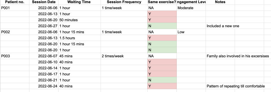
Field study — observing 10 patients over a month
I observed 10 patients multiple times per week to gather firsthand insights into their rehabilitation patterns. The data was striking.
Interviews — 6 qualitative sessions
I conducted semi-structured interviews with 4 patients (stroke, mild TBI, and Alzheimer's) and 2 caregivers — exploring pain points, preferences, and feedback on existing tools.
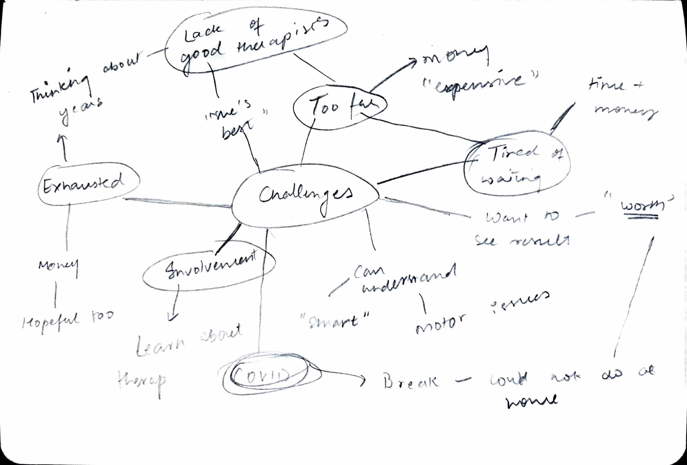
"We live very far away, and coming here twice a week gets expensive."
"If I'm being honest, I feel he is doing the same task again and again. I want to see improvement."
"We understand this is a life-long thing now. But coming here every week is getting tough."
02 — Insights
4 themes that shaped the entire design
After transcription and thematic analysis, four recurring themes emerged — each pointing directly to a design decision.
- Access barriers. Financial constraints and therapist availability limited how often patients could attend sessions.
- Return on investment. Patients felt stagnant — they wanted to see measurable progress, not just show up and repeat.
- Long-term therapy integration. Recovery is a life-long process. Patients needed a way to integrate rehab into daily routines.
- Caregiver support. Caregivers were deeply involved but had no tools to track or support progress from home.
Competitive analysis — what's missing
Evaluating HeadApp, Lumosity, and CogniFit across 5 dimensions revealed a consistent gap: none offered both personalization and progress tracking for neurological patients specifically.
| Feature | HeadApp | Lumosity | CogniFit | NeuroScape |
|---|---|---|---|---|
| Ease of analysis | ✕ | ✓ | ✓ | ✓ |
| Progress tracking | ✕ | ✕ | ✓ | ✓ |
| Price | $19.99/mo | $11.99/mo | $19.99/mo | Free (research) |
| Personalization | Cognitive profile | Not user-specific | Not user-specific | Condition-specific |
| Target audience | Brain injuries | General | General | Rehab patients & caregivers |
03 — Design
From sketches to structure
Using the Crazy 8s method, I rapidly explored diverse concepts — mood boards guided the aesthetic direction. Low-fidelity prototypes kept focus on content and flow before committing to any visual direction.
04 — Testing
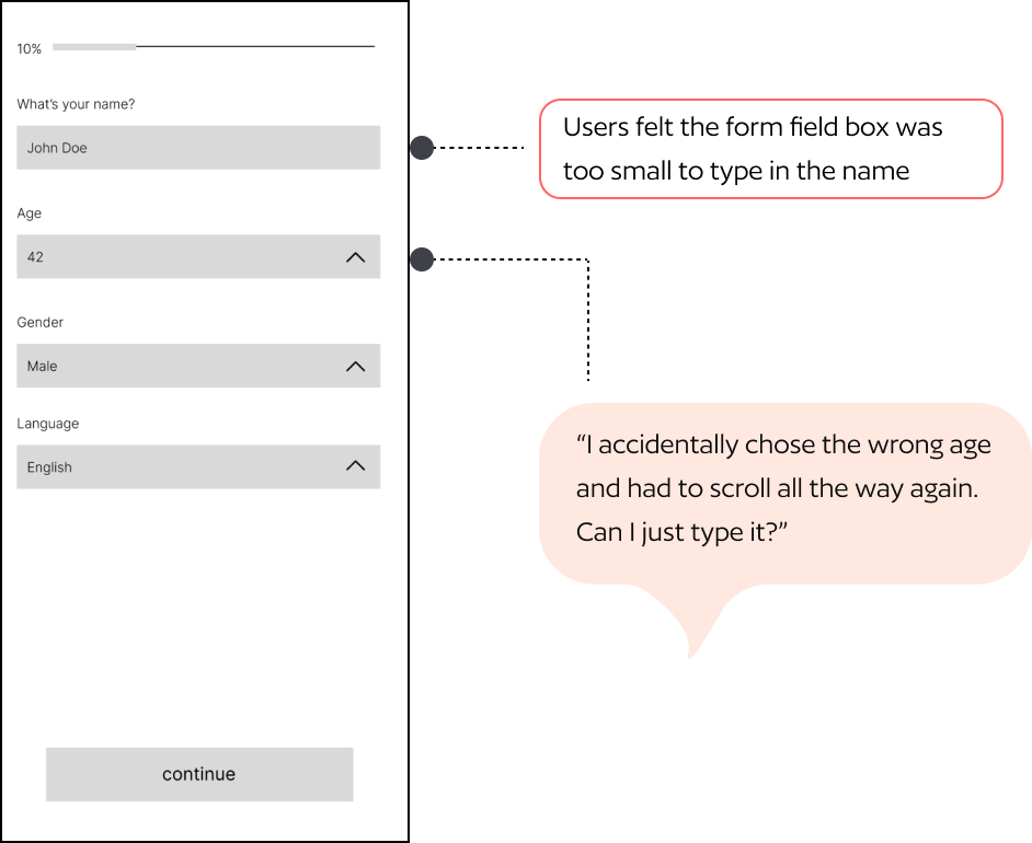
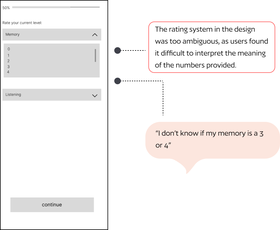
Two rounds of testing, three significant changes
I ran moderated usability testing with 4 participants (3 patients + 1 caregiver) using mid-fidelity prototypes and a think-aloud protocol across 5 tasks. Their feedback drove targeted revisions before the high-fidelity pass.
What testing revealed — and what changed
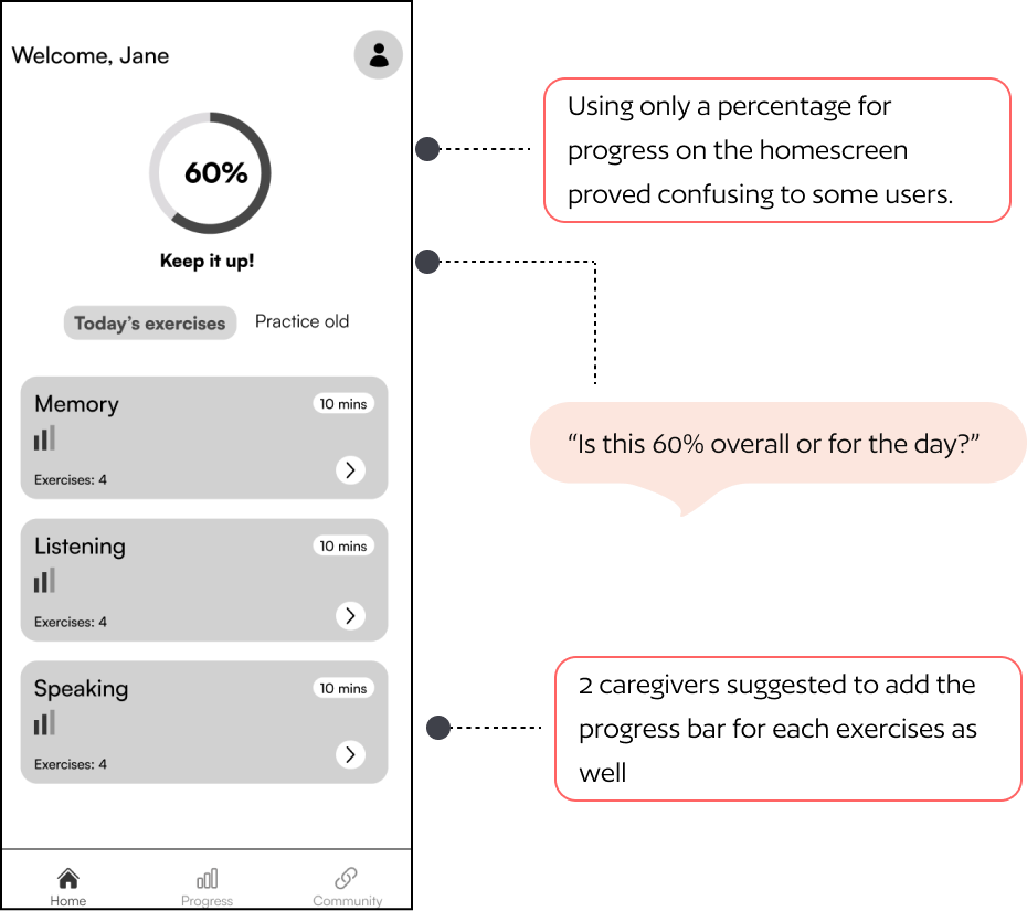
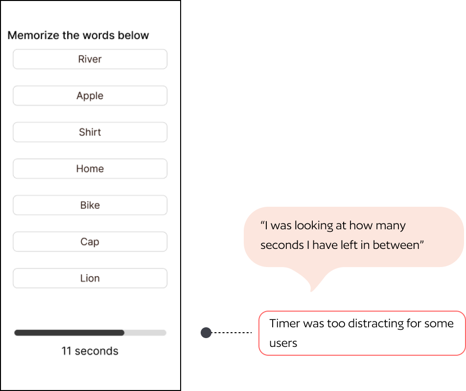
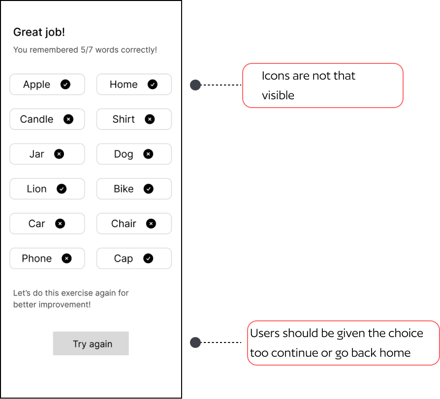
Round 1 usability testing insights
Five tasks tested across 4 participants using the think-aloud protocol. Testing images below show annotated insights per screen.
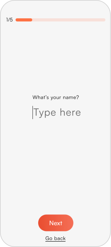
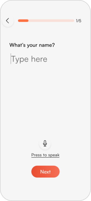
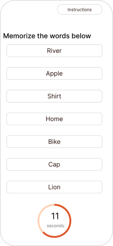
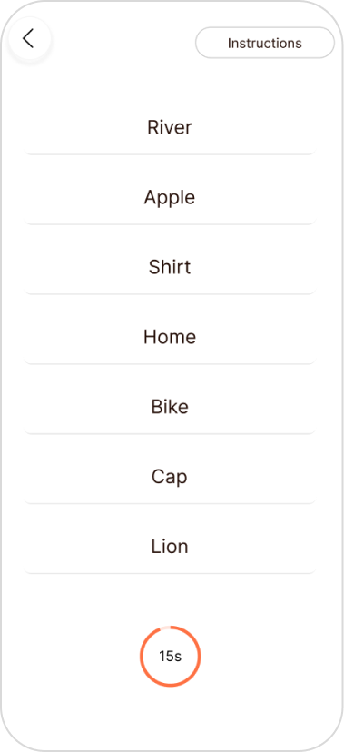
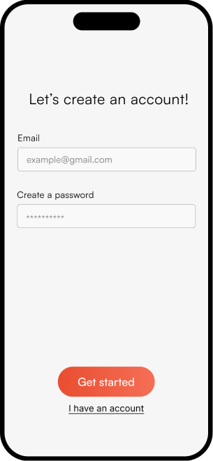
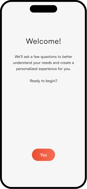
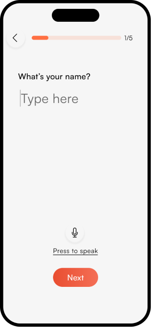
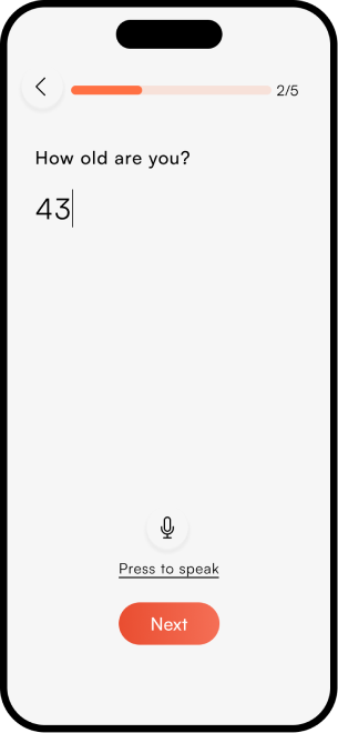
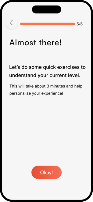
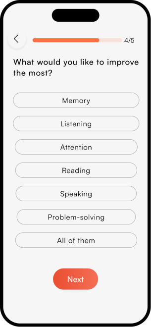
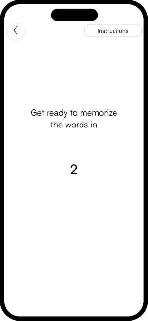
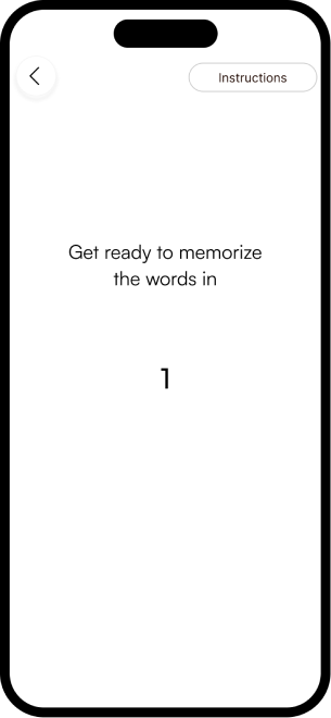
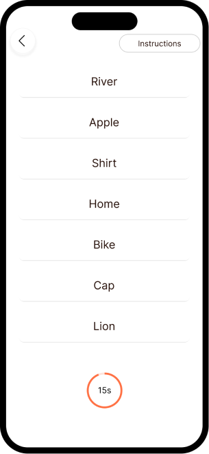
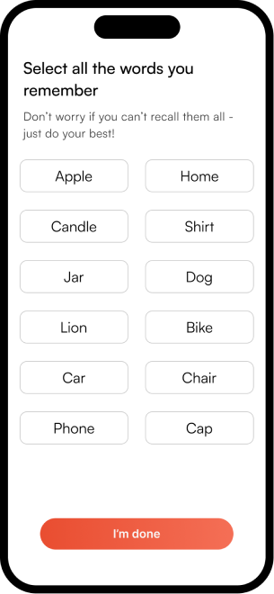
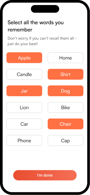
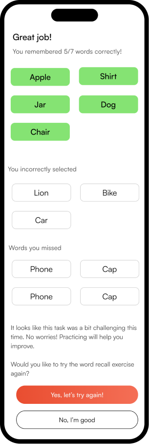
05 — Solution
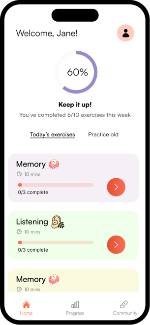
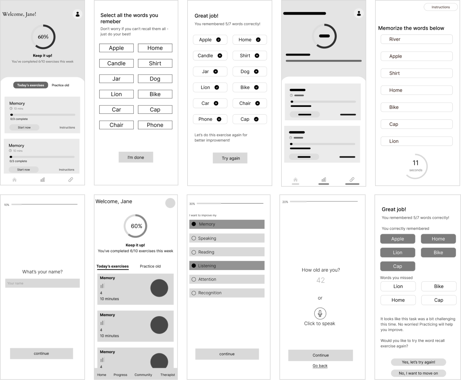
The complete NeuroScape flow
The final high-fidelity design focused on a seamless, intuitive journey for both patients and caregivers — simplifying complex rehab tasks into manageable, engaging steps that fit into daily life.

06 — Reflection
What this project taught me
- Research your field deeply. Having in-depth knowledge of cognitive rehabilitation let me frame interview questions that resonated with users. The field context shaped every design decision.
- Resist the pull toward polish. It required conscious effort to stay low-fidelity early — embracing roughness to explore broader ideas before committing to any direction.
- Ideate in many dimensions. Crazy 8s, mood boards, and mind mapping in combination produced richer outcomes than any single method alone.
